12 important CSS topics by Kenno
An attempt to comprehend Cascading Style Sheets' basic concepts and how they are applied to the presentation of HTML documents.

Building 👉 https://startupmaya.com
it happened again… and I have no choice but to publish this article of Kenno🐛 under my account. It seems that as long as I am not getting rid of this hair-raising situation, I will have to keep publishing like this.
Note: To fully appreciate this post, you must have a basic understanding of HTML. Possibly a good place to start is this article on HTML.
1. What
Cascading Style Sheets (CSS) is a style sheet language used for describing the presentation of a document written in a markup language such as HTML or XML. ~Wikipedia
To improve user experience, styles can be added to HTML documents using the style sheet language CSS. If HTML is the skeleton of a webpage then CSS everything on top of it (the flesh, the skin, the clothing etc.) If HTML is an X-Ray image of me then CSS is a picture taken by me using my cellphone. Interestingly in my case they both look the same most of the time, maybe I need to talk to my developer about this but I suppose you get the idea.
2. History
Since the inception of Standard Generalized Markup Language (SGML) in the 1980s, style sheets have existed in some form, and CSS was created to provide style sheets for the web. While collaborating with Tim Berners-Lee at CERN on October 10, 1994, Håkon Wium Lie, a Norwegian web pioneer, made the initial CSS proposal in order to offer style sheets for the web. And on December 17, 1996, CSS 1, the first W3C CSS Recommendation, was published following a thorough discussion.
3. Implementation
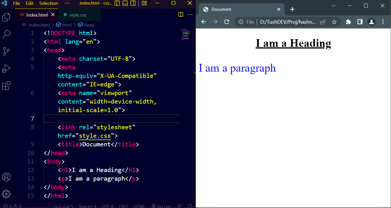
Let's assume, using CSS we need to (1) underline the heading (h1 element) and align it to the center (2) change the paragraph color to blue and increase its font size to 32px to the following webpage. Three distinct approaches are available for us to use.
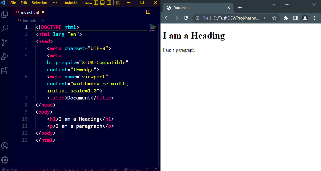
Approach 1:
Here we are using the style attribute directly inside h1 & p elements. This approach is known as Inline CSS.
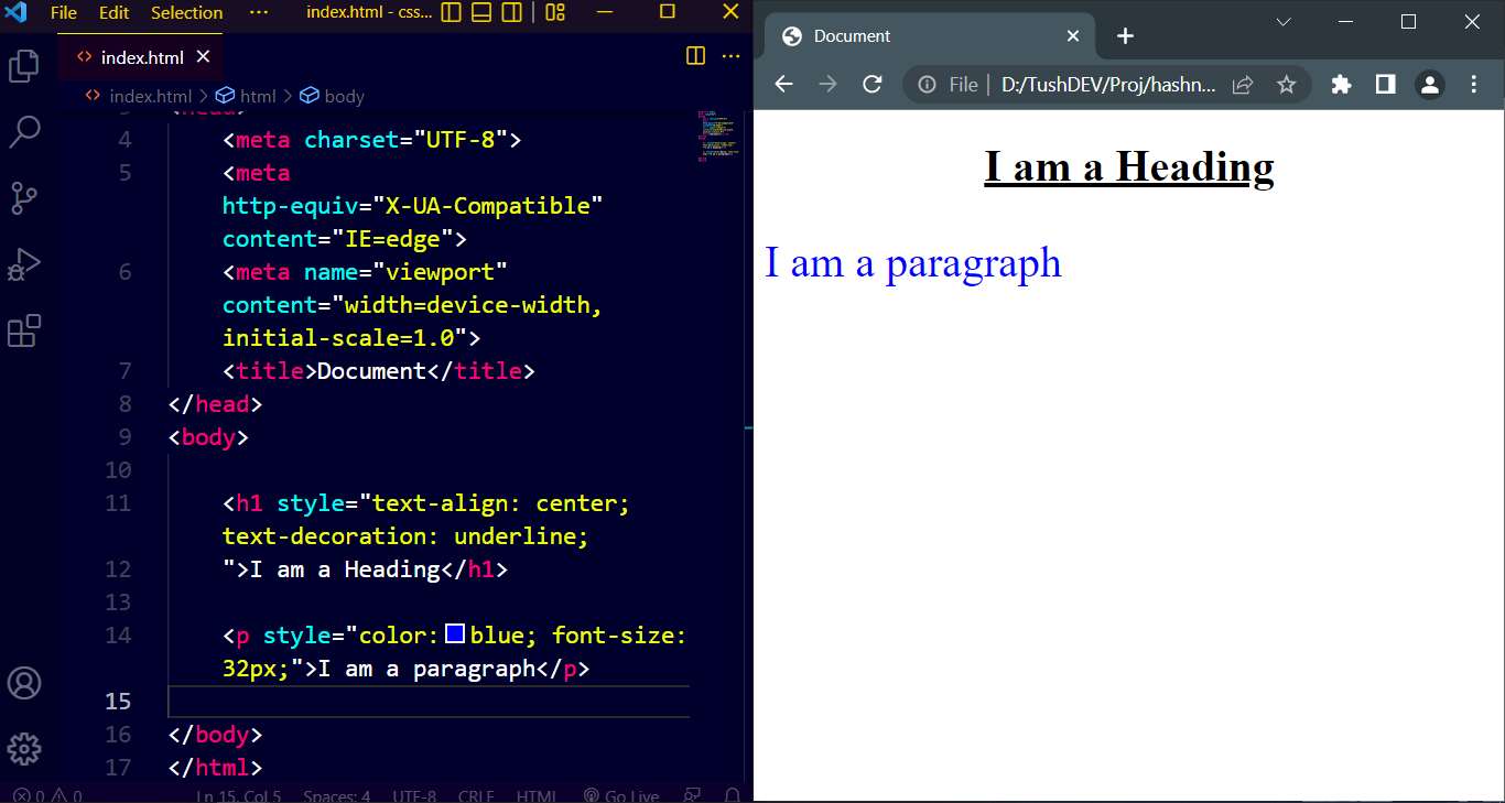
Approach 2:
Here we are using style element, inside the head element and targeting h1 & p elements. This approach is known as Internal CSS.
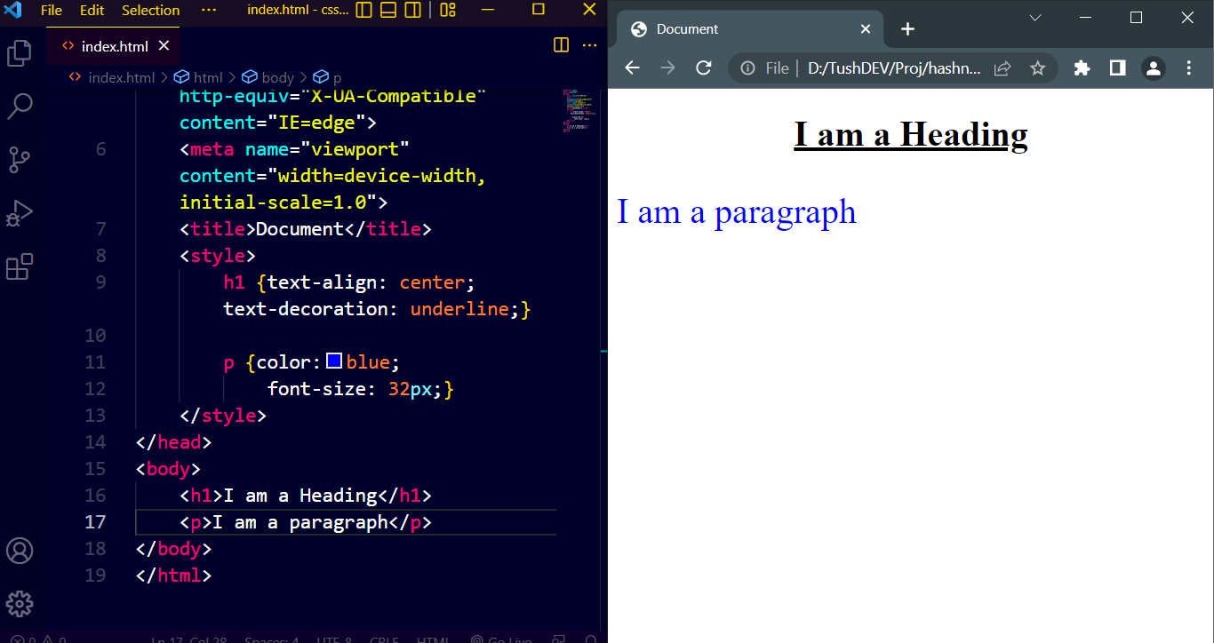
Approach 3:
It is a 2 step process. Step one is creating a separate style sheet, like this:
Step two is linking the style sheet inside the head element, using a link element. This approach is known as external CSS. Technically, to style an HTML document any of the approaches can be used but the standard practice is to use external CSS files
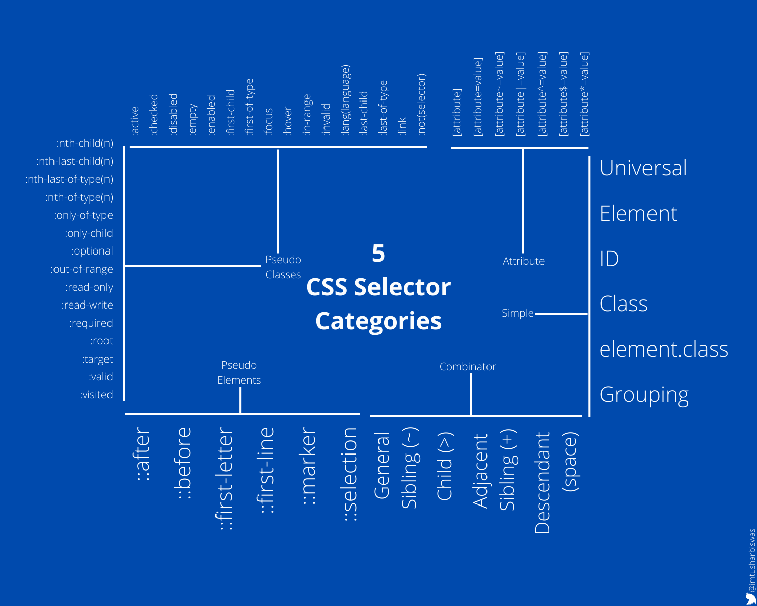
4. Selectors
The HTML element(s) we want to style are selected or targeted using selectors. CSS Selectors can be divided into five different categories.
5. Box model
In web development, the CSS box model refers to how HTML elements are modeled in browser engines and how the dimensions of those HTML elements are derived from CSS properties. It is a fundamental concept for the composition of HTML webpages. ~Wikipedia
It is related to the design and layout of all HTML elements. Every HTML element can be treated in this model, as a box with a margin, border, and padding. We will be able to better manipulate HTML elements if we understand the fundamentals of the box model.
Total width of a box or element =
left-margin + left-border + left-padding + element width + right-padding + right-border + right-margin
Total height of a box or element =
top-margin + top-border + top-padding + element height + bottom-padding + bottom-border + bottom-margin
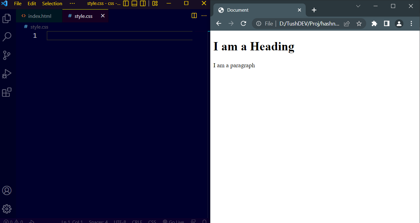
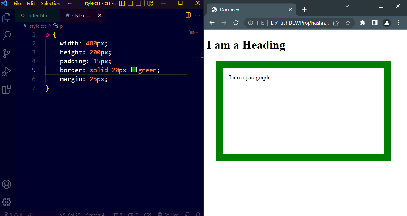
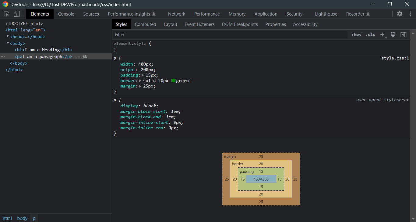
Let's use Chrome DevTools (a collection of built-in web developer tools in the Google Chrome browser) to investigate the paragraph (an HTML element) to better comprehend the box model notion. "Ctrl+Shift+I" or F12 can be used to open DevTools. And I'll stick with the paragraph's standard color and font size for simplicity. The website with no CSS will look like this:
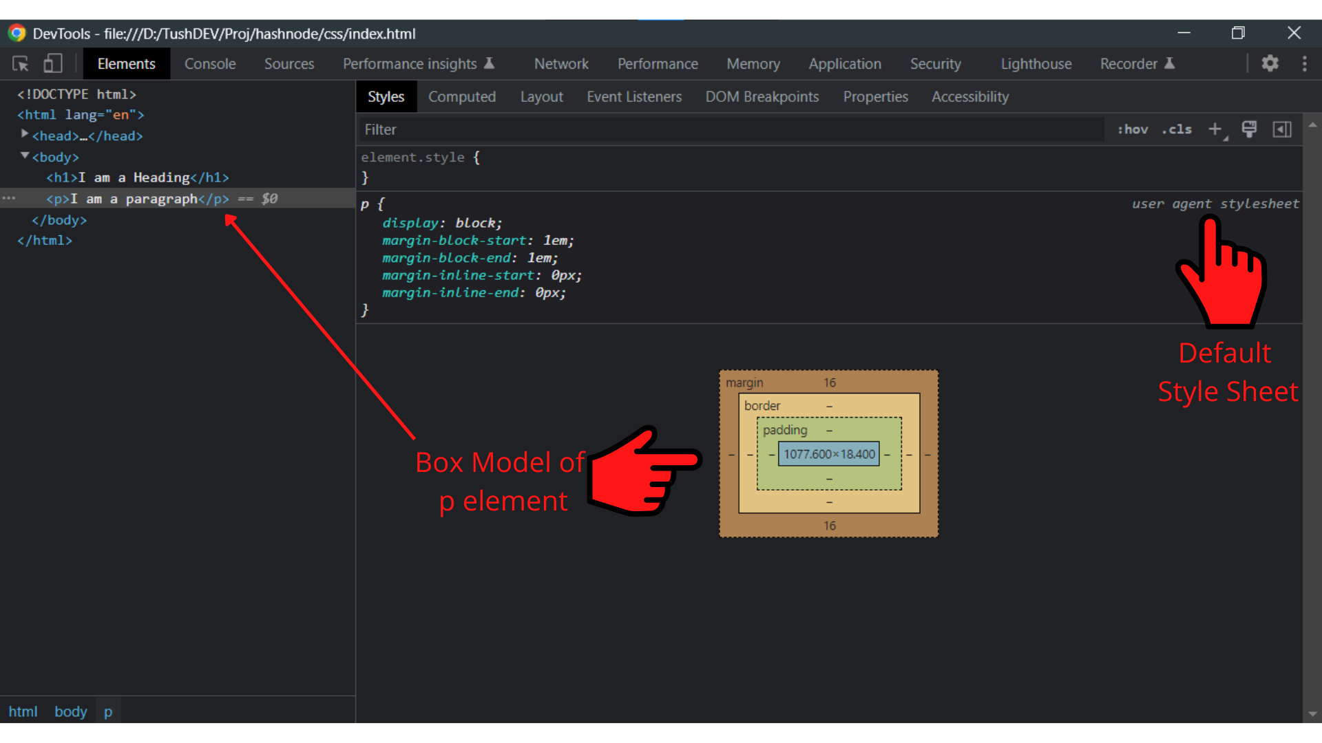
We can see that there is something called "user agent stylesheet" in the DevTools. When an HTML element is not customized or styled by the developer, the browser engine automatically generates this default style sheet. The default margin, in this case, is 1em (16px).
However, the default style sheet is overridden when we apply custom styling to an HTML document.
The custom style sheet can be seen in the DevTools and changes in the box model can also be 0bserved.
6. width and max-width
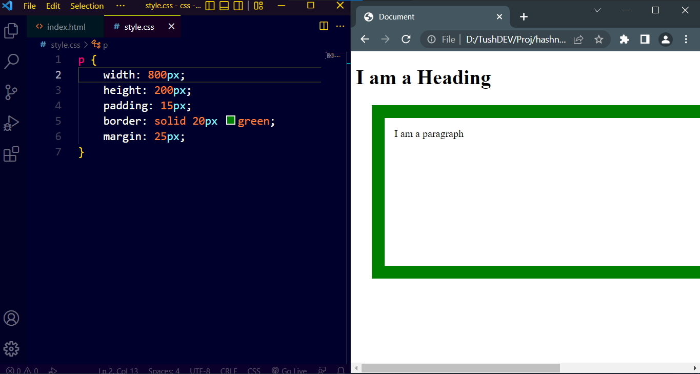
Typically, we set a block level element's width to prevent it from occupying the entire available width, and to limit it to a predefined width in accordance with the requirement.
However, the browser adds a horizontal scrollbar to the website when the width of the browser window on a particular device is less than the width of the HTML element. This is a problem in terms of responsiveness.
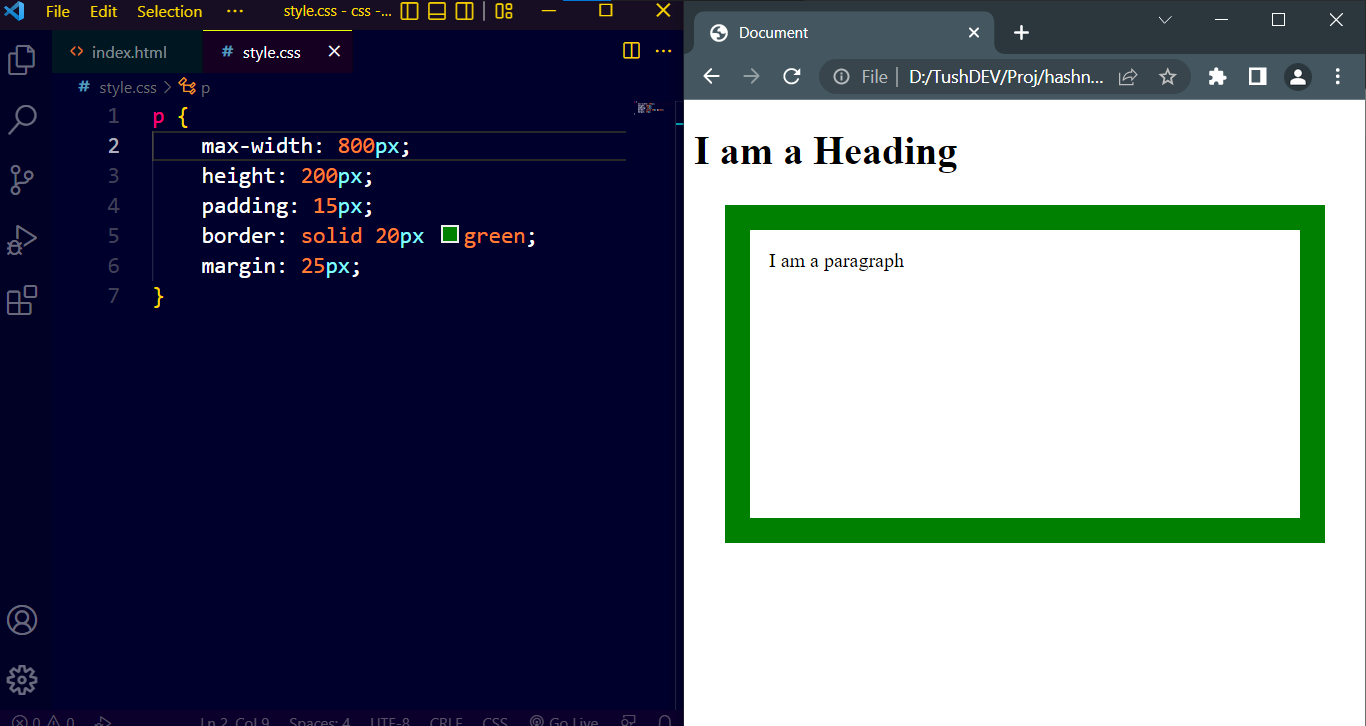
The HTML element will automatically resize and fit within the available space as much as possible if max-width is used in place of width, and there won't be a horizontal scrollbar if the browser window of a device is smaller than the width of the HTML element.
Webpage with a horizontal scrollbar:
Webpage without a horizontal scrollbar:
7. Position
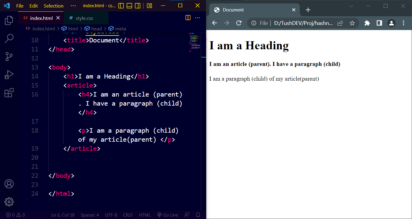
HTML typically aligns the content to the left and the top of the available space. To position HTML elements according to our specifications, we must first declare the type of the CSS position property before using top, bottom, left, and right with various values. Five different position values are available. Let's use examples to clarify each of them. We will comprehend the behavior of the position property better if we add borders to our elements.
Static: HTML elements are positioned static by default. The top, bottom, left, and right attributes have no effect on elements that are static in their positions.
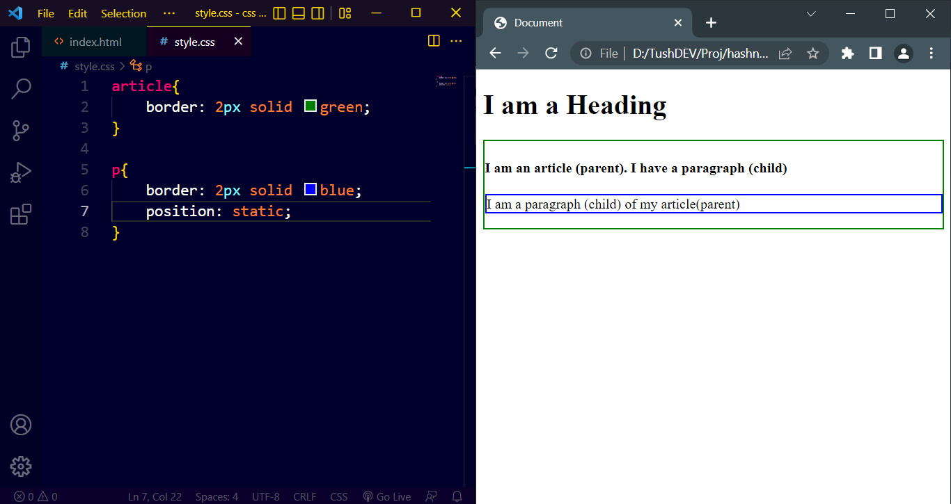
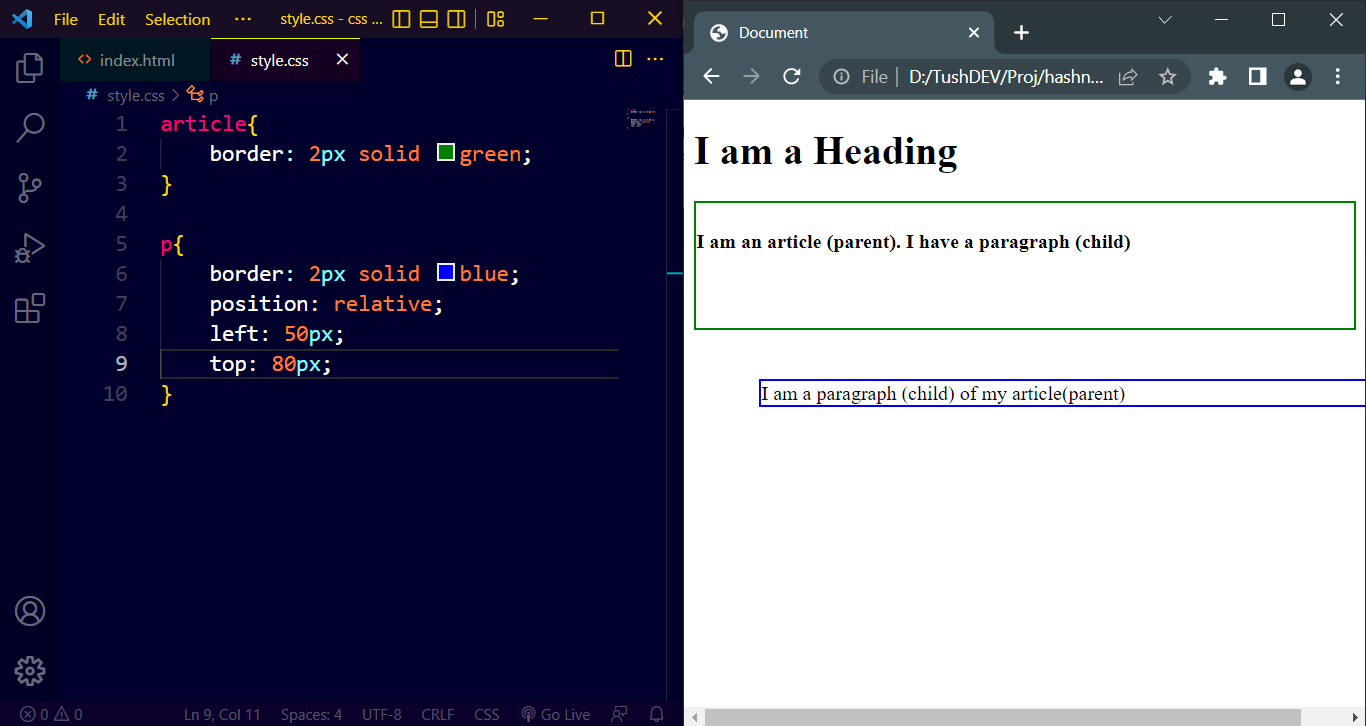
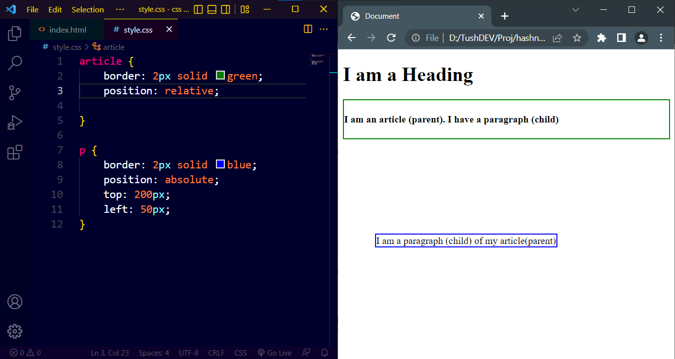
Relative: HTML elements declared with position relative can be placed in position away from its normal position using top, bottom, left, and right properties.
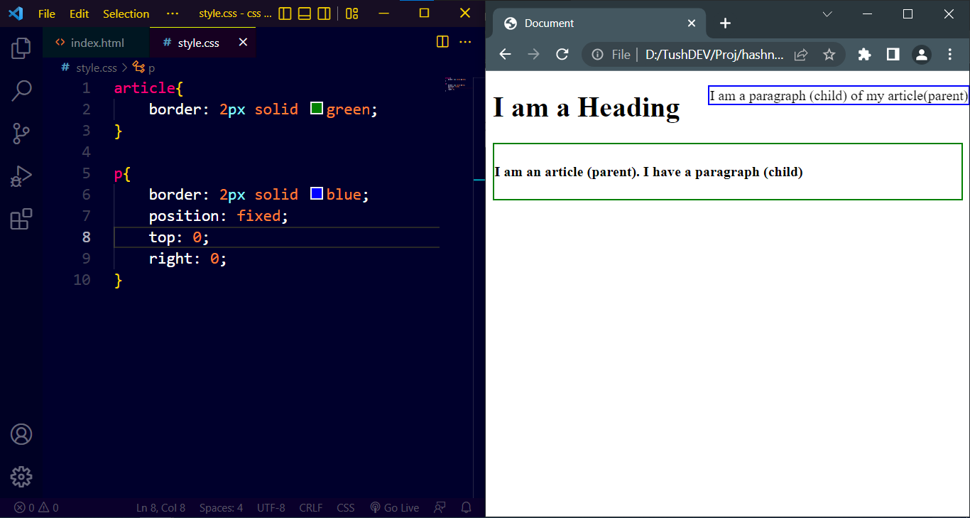
Fixed: Once placed into a desirable spot using top, bottom, left, and right properties, a fixed positioned element always stays in the same place even if the page is scrolled.
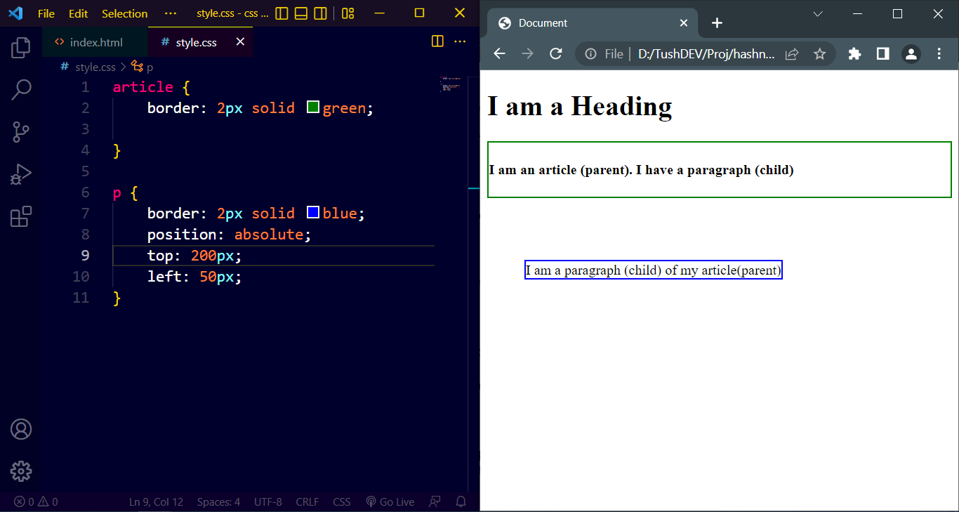
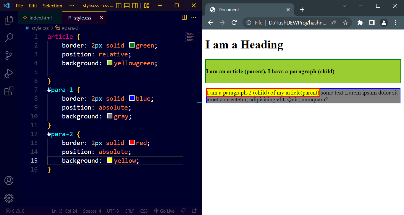
Absolute: An absolute positioned element can be positioned at a desirable place using, top, bottom, left, and right properties relative to either the nearest positioned ancestor of it or the document body when it doesn’t have any positioned ancestors. Absolute positioned elements are removed from the normal flow, and can overlap elements.
Absolute to the Ancestor:
Absolute to the document body:
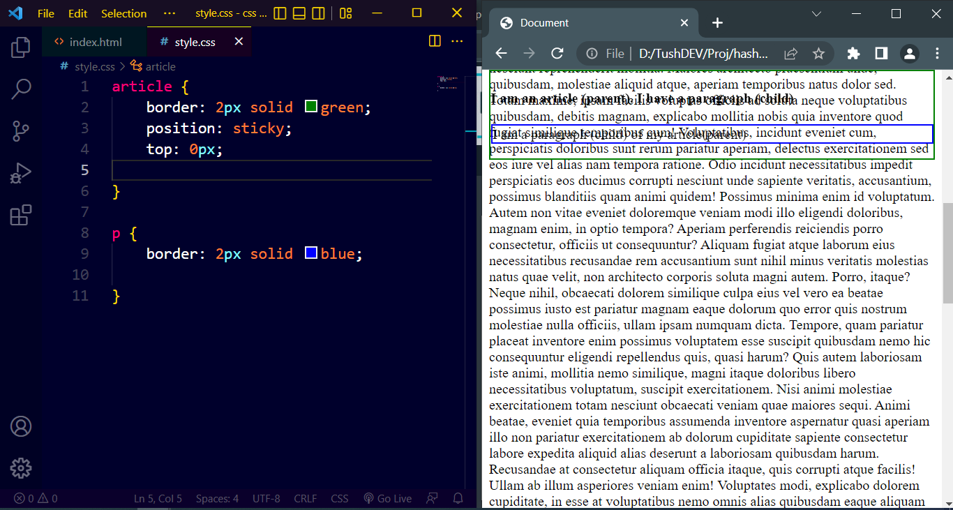
Sticky: Depending on the scroll position, a sticky element switches between relative and fixed. It is relative until a predetermined offset position is reached in the browser window, at which point it "sticks" there (like position: fixed). For this example added some content to enable scrolling and applied the sticky value to the parent element.
8. z-index
Positioned HTML elements may occasionally overlap. To determine which element should be placed in front and which one should be behind, we can utilize the z-index property, which can have a positive or negative value. An HTML element with a higher z-index value will show up in front of one with a lower z-index value.
Only positioned elements (position: absolute, position: relative, position: fixed, or position: sticky) and flex items are compatible with this feature (elements that are direct children of display: flex elements). The last element in the HTML code will be displayed on top if two elements overlap without a z-index value.
It is easy to forget that if an element's position property is not declared, z-index will not function.
Two elements overlapping without a z-index value (last element on top):
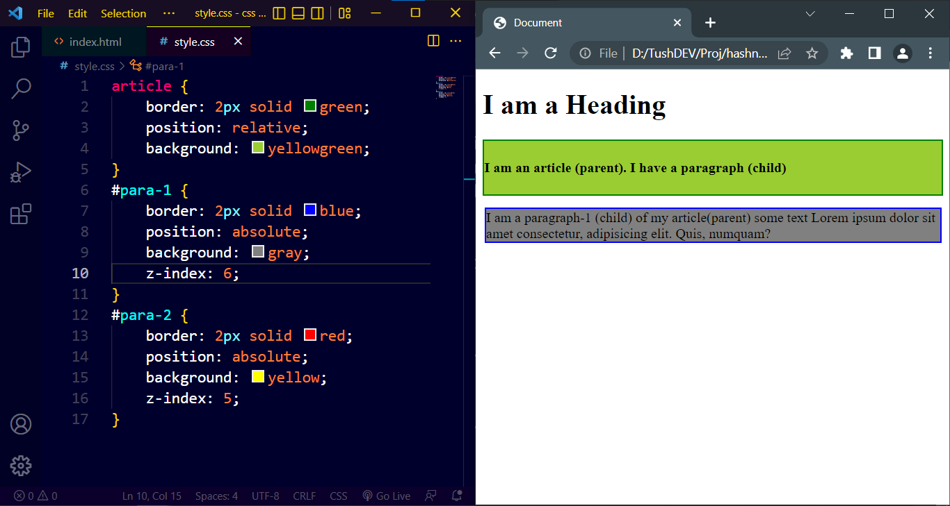
HTML element with a higher z-index value displaying on top (example-1):
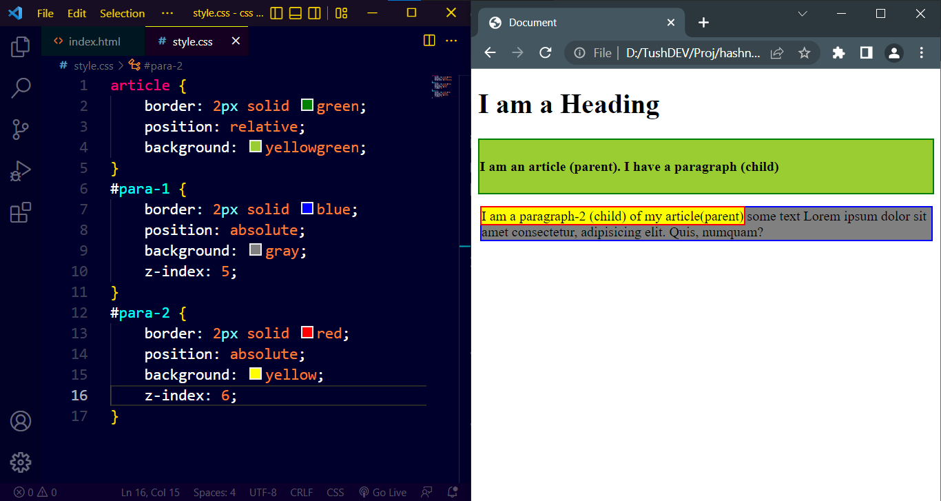
HTML element with a higher z-index value displaying on top (example-2):
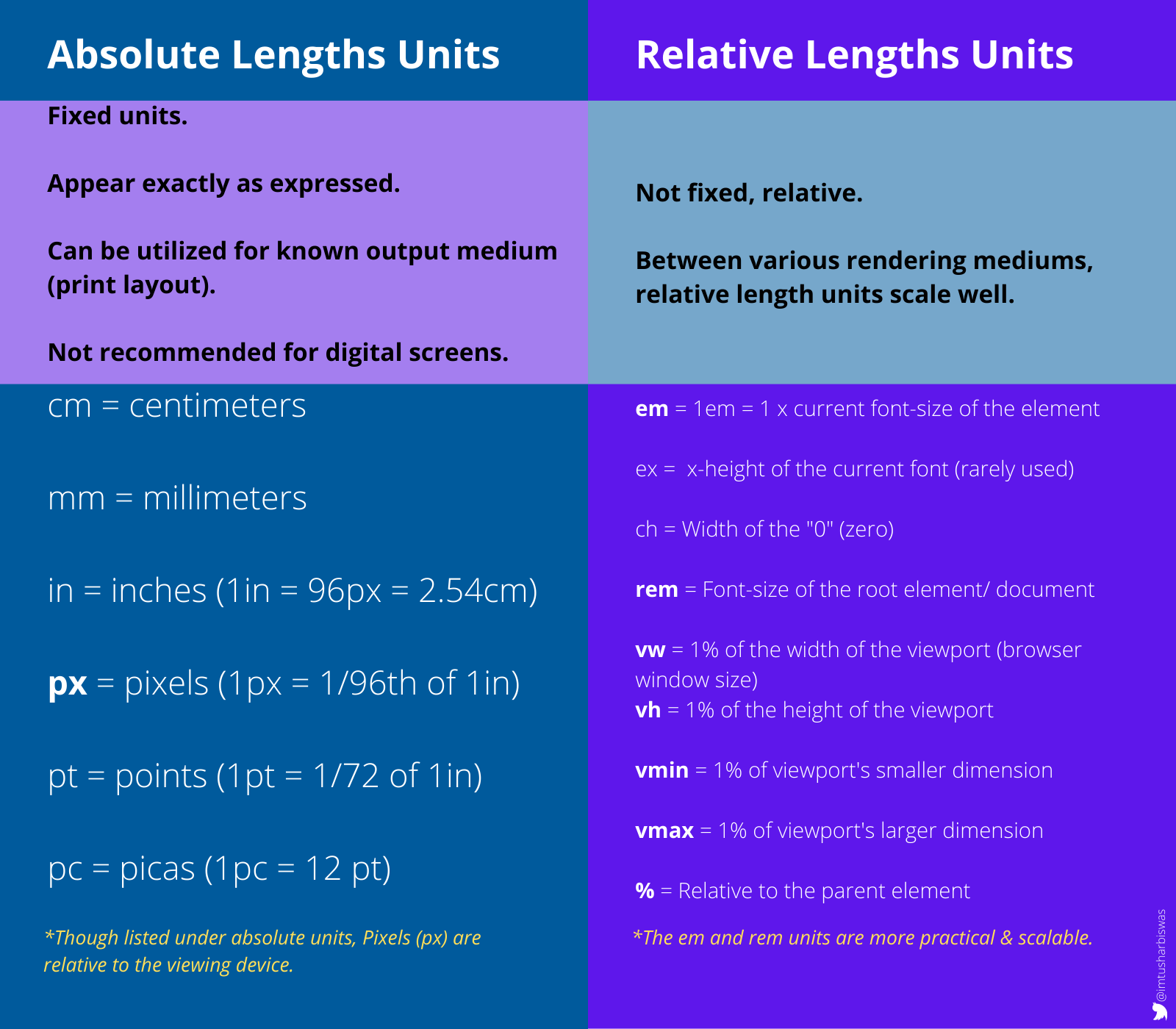
9. CSS Units
An HTML element's custom length can be expressed using CSS units. Negative lengths are permitted for some CSS properties. The two types of length units are absolute and relative.
Absolute Lengths A length expressed in any of these will appear to be exactly that size since the absolute length units are fixed. Because screen sizes vary so widely, it is not advised to use absolute length units on screens. They can be utilized, nevertheless, if the output medium is known, like in the case of print layout.
Relative Lengths A length relative to another length property is specified by relative length units. Between various rendering mediums, relative length units scale well.
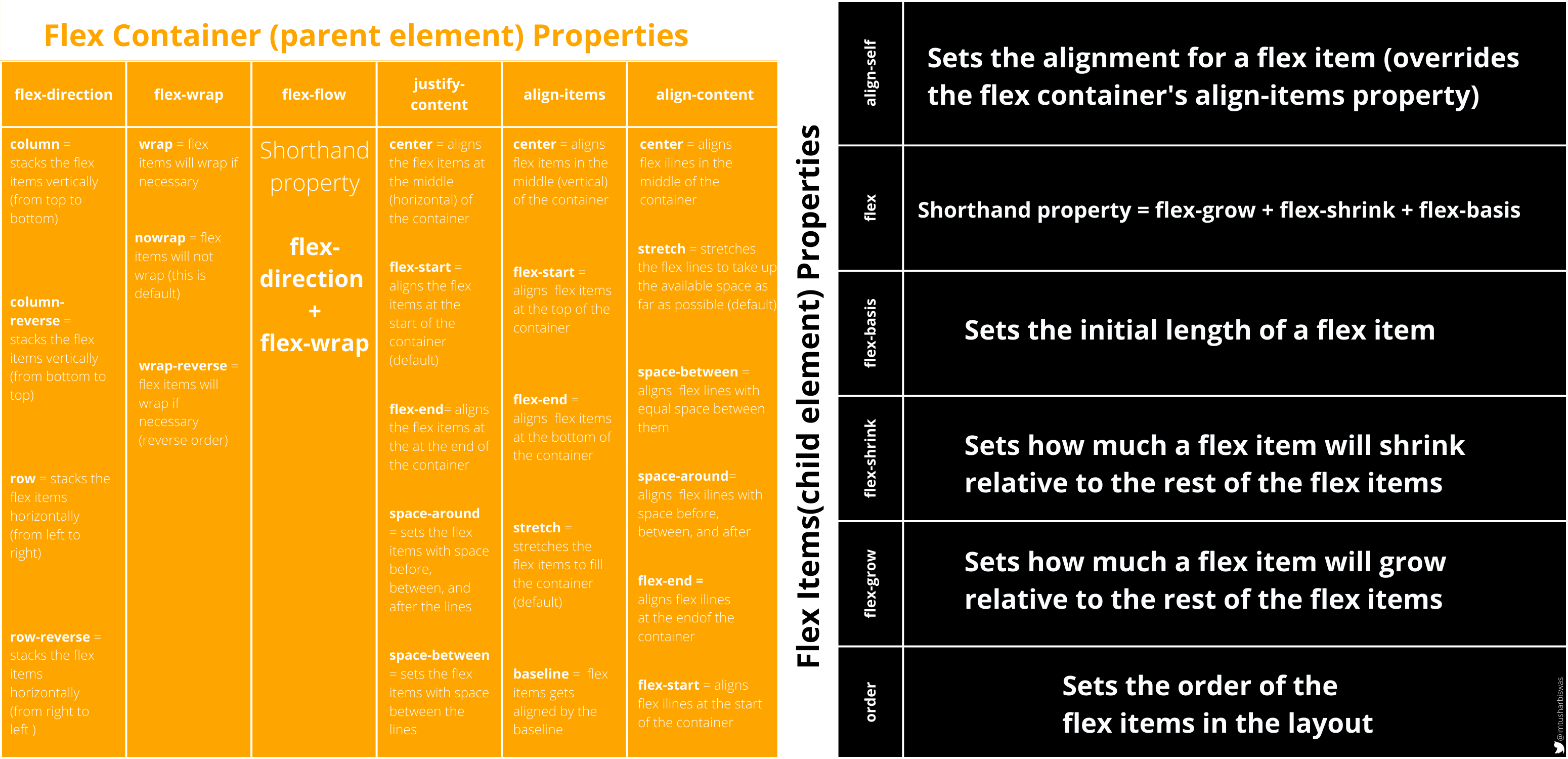
10. Flexbox
CSS Flexible Box Layout, commonly known as Flexbox, is a CSS 3 web layout model. The flex layout allows responsive elements within a container to be automatically arranged depending upon screen size (or device). ~Wikipedia
When it comes to build a responsive and flexible web layout, this layout module allows us more power and simplifies the job of a developer. Prior to flexbox, positioning or float were used to create responsive layouts.
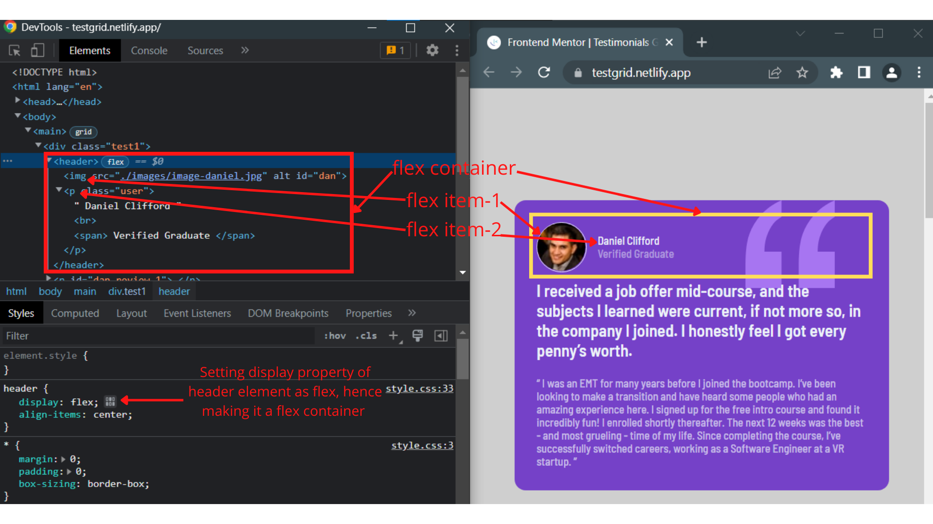
When we set an HTML element's display property to "flex," the element transforms into a "flex container" (parent element), and all of the elements inside the flex container instantly become "flex items" (child elements). To further understand this, let's use https://testgrid.netlify.app as a live example. This testimonial page was created using grid and flexbox. Take a look at the image below.
Once we have a flex container and flex items, we can use their corresponding properties to change the layout in a variety of ways. Checkout various flex properties and their usage.
In this post, we won't go over every property with an example, but I'd like to show you how the layout changes when flex isn't used. (If you like, you may also give it a shot yourself. Using Chrome, navigate to https://testgrid.netlify.app, activate DevTools, select the header under "Elements," and then uncheck the display property under "Styles.") Did you notice the change ?…
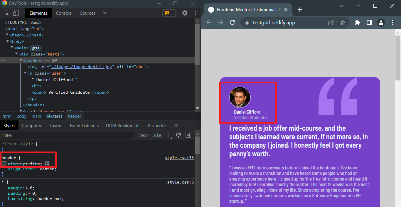
The img and p elements now stack on top of each other, because flexbox has been deactivated. Check the display property again and things will be back to normal.
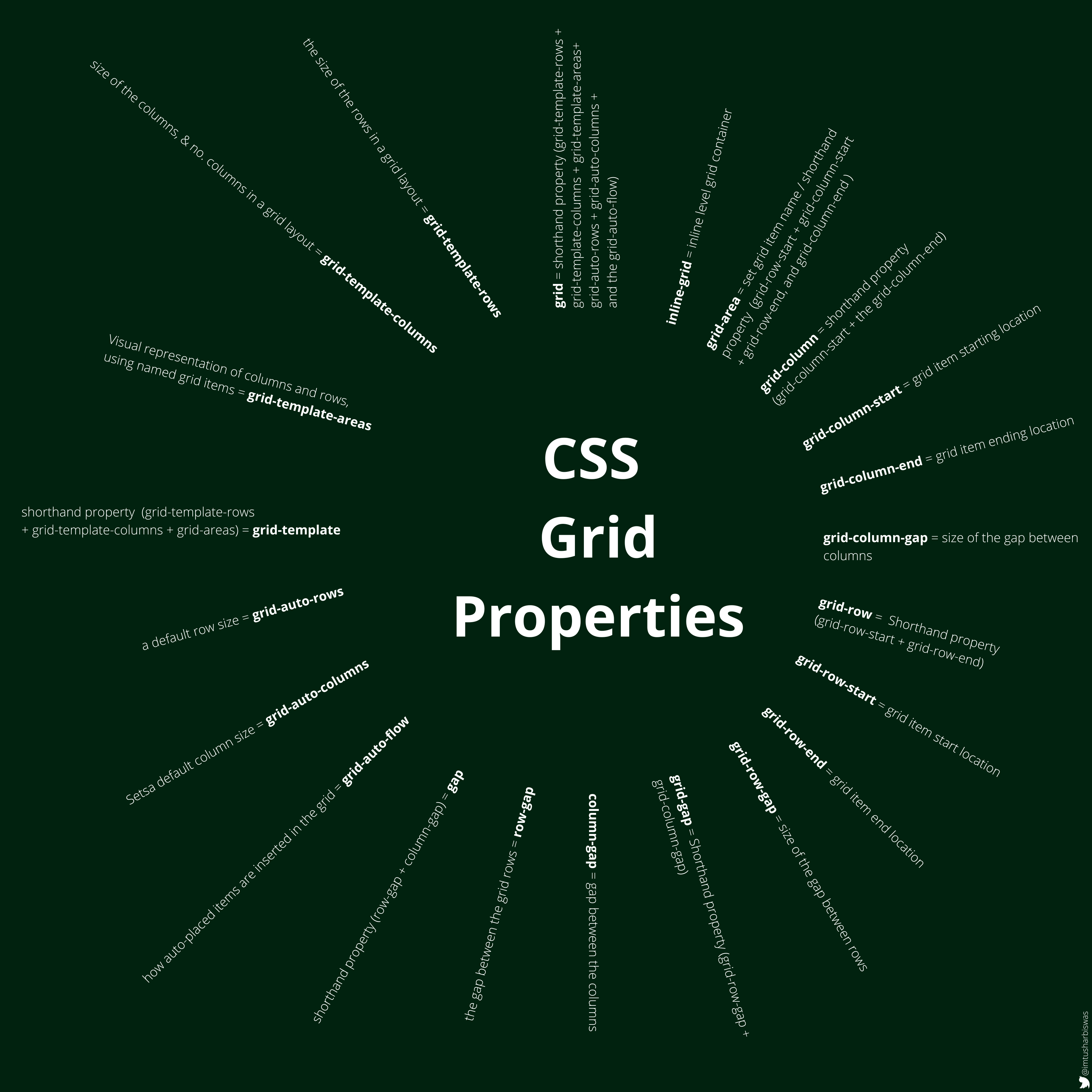
11. Grid
In Cascading Style Sheets, CSS grid layout or CSS grid creates complex responsive web design grid layouts more easily and consistently across browsers. Historically, there have been other methods for controlling web page layout methods, such as tables, floats, and more recently, CSS Flexible Box Layout (flexbox). ~Wikipedia
When we declare the display property of an HTML element as “grid” the element becomes a grid container(parent element) and all elements within the flex container automatically become grid items (child elements).
Explore the utilization of various grid properties.
Let's examine a few of the grid properties utilized by https://testgrid.netlify.app/ now.
CSS rules for the main element:
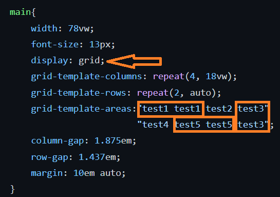
Since the display property of the main element is declared with “grid” it has become the grid container with 4 columns and 2 rows. Width of each column is “18vw ” and the width of each row is set to “auto”. The gaps between the columns and rows are 1.875em and 1.437em respectively. The “grid-template-areas” property is being used to put grid items into their respective locations. And the same layout is implemented in the webpage. This is a cool feature isn't it?
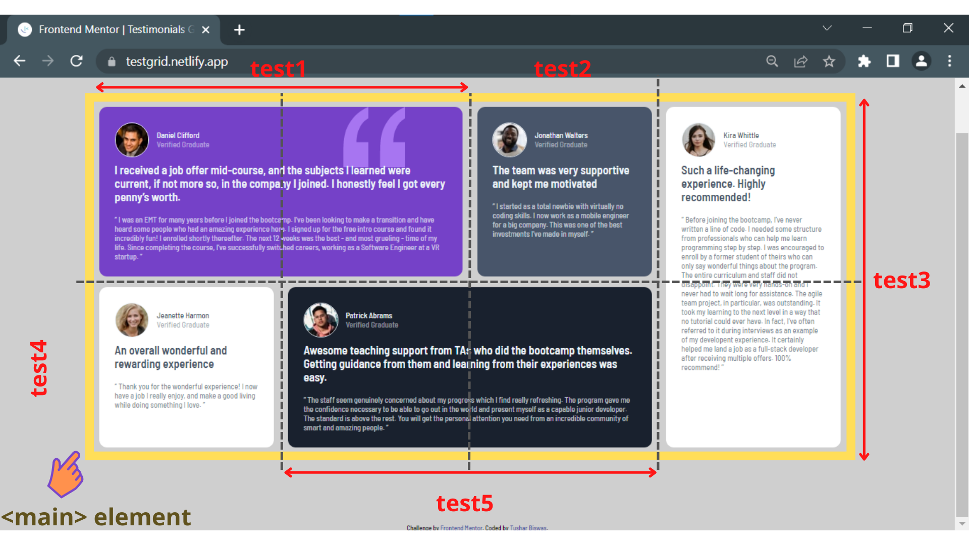
There are a total of five grid items (testimonials) that have been used in this project website (test1, test2,test3,test4,test5). grid-area property has been used to define the name of the grid items. You may find the source code of the website here. Achieving this kind of layout without using “CSS grid” is a very painful task. Some benefits of CSS grid are faster development, fewer lines of code, smaller file size, and easier to modify web layout by manipulating grid items.
12. Media Queries
Media queries is a feature of CSS 3 allowing content rendering to adapt to different conditions such as screen resolution (e.g. mobile and desktop screen size). It became a W3C recommended standard in June 2012,[1] and is a cornerstone technology of responsive web design (RWD). ~Wikipedia
It is a popular web development technique to deliver a tailored style sheet for different screen sizes and devices. A simple media query has been implemented in https://testgrid.netlify.app/ and as a result, it looks different on different screens. On screens that are 600px or less layout will change from 4 columns and 2 rows to 1 column and 5 rows.
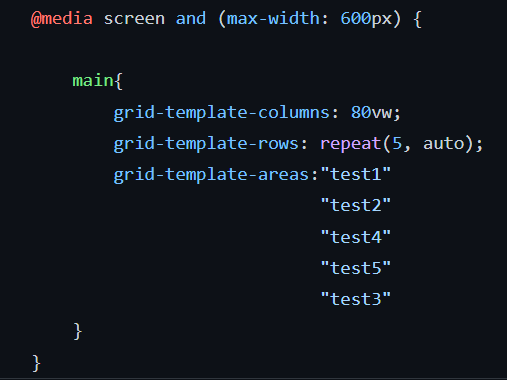
Desktop view:
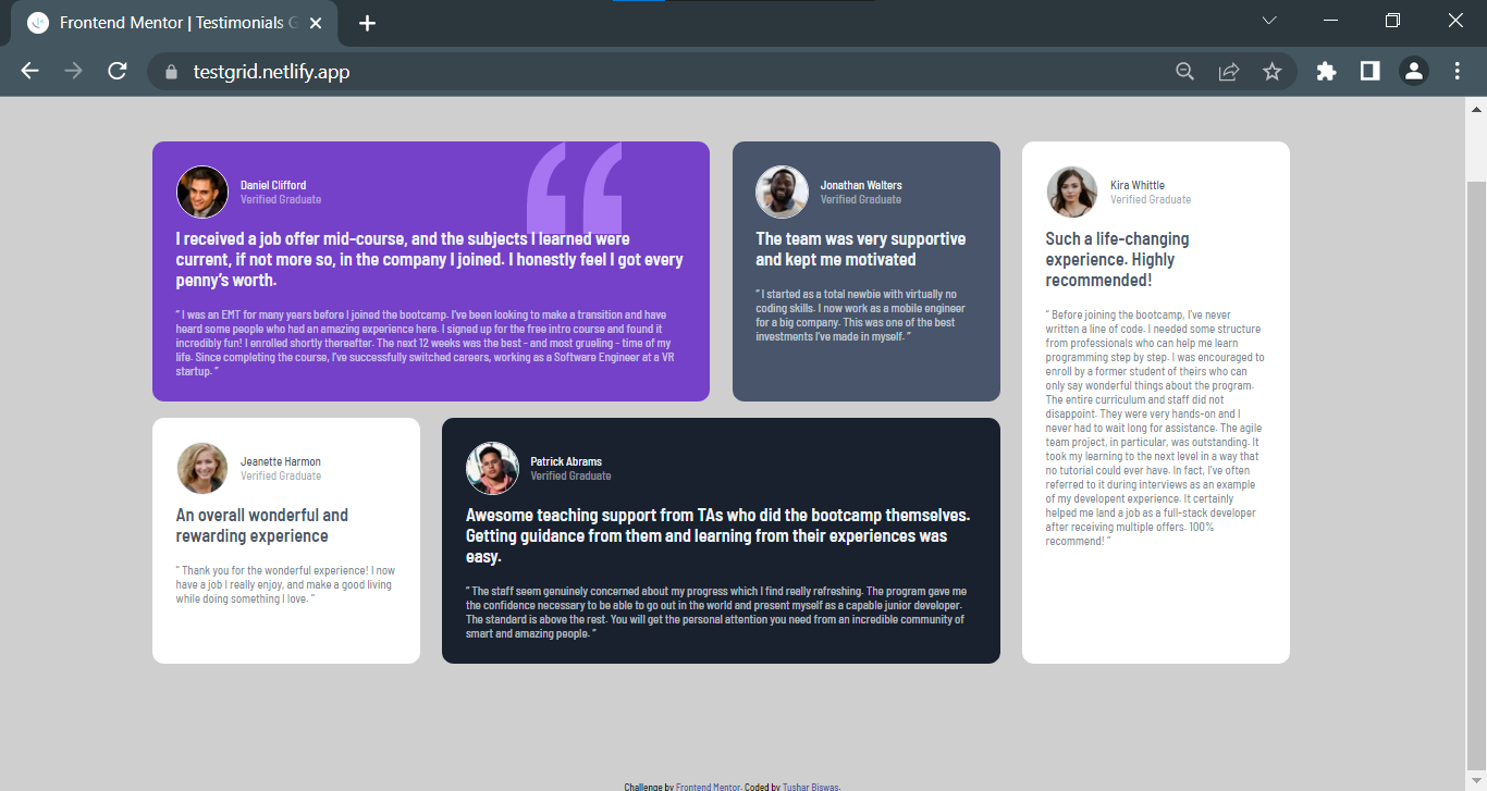
Mobile view:

Media query breakpoints, often known as breakpoints, are points where website content adjusts to the user's device width to present the optimum layout. However, It is challenging to establish a precise breakpoint for each device because there are numerous screens and devices with varying heights and widths and that's why to keep things simple, we might focus on the following typical breakpoints Groups:
@media only screen and (max-width: 600px) {...} = Extra small devices with 600px and below.
@media only screen and (min-width: 600px) {...} = Small devices like portrait tablets and large phones with 600px and above.
@media only screen and (min-width: 768px) {...} = Medium devices like landscape tablets, 768px and above.
@media only screen and (min-width: 992px) {...} = Large devices like laptops/desktops, 992px and above.
@media only screen and (min-width: 1200px) {...} = Extra large devices like large laptops and desktops, 1200px and above.
13. Mobile-First Workflow
A mobile-first workflow is an approach to web design and development that prioritizes designing and building websites or applications for mobile devices first, and then progressively enhancing them for larger screens and devices. Presently, I follow this simple technique for my projects.
Most beginners find it difficult to adapt to a mobile-first workflow in the early phase. And I was not an exception. In my initial projects, all I wanted was to design the desktop view as close to the original design as possible. It took some time for me before I switched from a desktop-first to a mobile-first workflow.
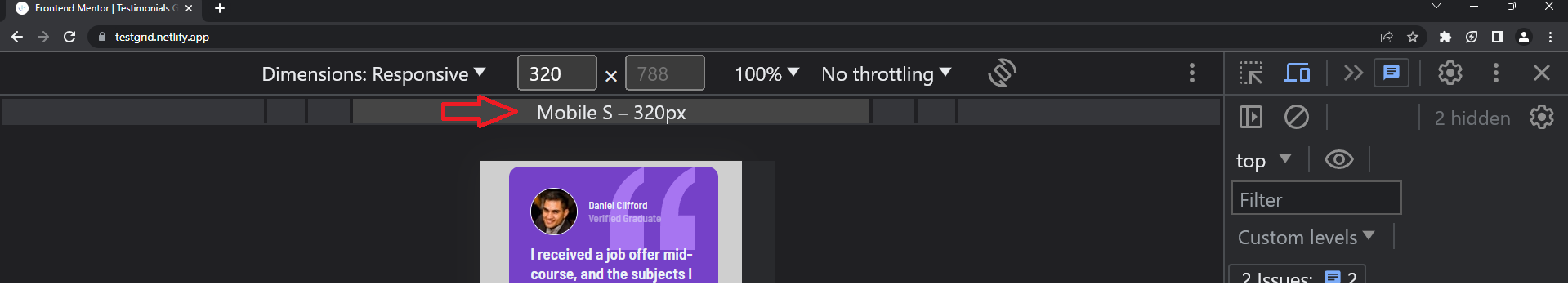
I start developing with Mobile S - 320px in chrome dev tools:
Next for Mobile M - 375px:

Then for Mobile L - 425px:

And Tablet-768px

And Laptop - 1024px and so on...

Few Best Practices:
📱 Start with a mobile-first approach: Design and implement styles for smaller screens first, and then progressively enhance for larger screens.
🖥️ Use breakpoints: Define breakpoints at specific screen widths where the layout or design needs to change. This helps to ensure a smooth transition between different screen sizes.
📐 Keep it modular: Organize your CSS code into reusable and modular components to maintain a scalable and maintainable code base.
💡 Use min-width for media queries: By using min-width, you can target specific screen sizes and up, allowing your styles to be applied to larger screens while still maintaining the smaller screen styles.
⚡ Optimize performance: Optimize your media queries to minimize unnecessary CSS code and reduce file sizes for faster loading times.
That's all for this post, everyone. This is not an exhaustive CSS article, but rather a CSS starting point. I have covered the topics that I believe are important to build the foundation of CSS and may be treated as an inspiration to start learning CSS. I might cover some other important aspects of CSS in future posts but not necessarily in sequence.
Hello there 👋 Thank you very much for taking the time to read this post🙏 Please feel free to share your ideas, recommendations, comments, questions and I'll forward them to "Kenno". Also, if you've written something or have a reference on the same subject, kindly share it with me and I'll do my best to read it. I'll catch up with you later🙂


![History of SaaS [1960s-2020s] Emergence, Evolution, and Impact](/_next/image?url=https%3A%2F%2Fcdn.hashnode.com%2Fres%2Fhashnode%2Fimage%2Fstock%2Funsplash%2FDuHKoV44prg%2Fupload%2F42c6382f71ecc519f04b83fe9f9c67e9.jpeg&w=3840&q=75)