How to Build a Simple App with Next.js 13.4.5 (App Router), TypeScript, and Tailwind 🚀
A Next.js-beginner friendly article by a self-taught developer with lots of screenshots...

Building 👉 https://startupmaya.com
To make the most of this article, please ensure you have the following:
✅ A solid grasp of HTML, CSS, and JavaScript with hands-on experience. 🌟💻
✅ An intermediate-level understanding of TailwindCSS, Node.js, and React. 🚀🔧
For this project, I selected the age calculator challenge from frontend mentor.
Step 1: Setting Up the Project 🛠️
To begin, make sure you have Node.js installed on your machine. Then, create a new directory for your project and navigate into it using your preferred command line tool. Run npx create-next-app@latest command to initialize a new Next.js project and choose the options as follows👇

Then navigate to the project directory and open it with VS Code👇

The project file tree should look like this👇

Step 2: Project Cleanup🧹
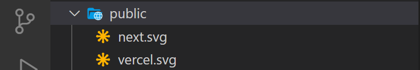
Remove vercel and nextjs logos from public directory.
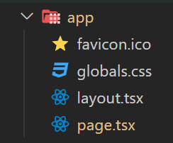
Let's take a look at the app directory and its content
Clean up the page.tsx in the app directory and after cleaning it should look like this
export default function Home() {
return (
<main> </main> )
}
Then clean up the globals.css file and it should look like this

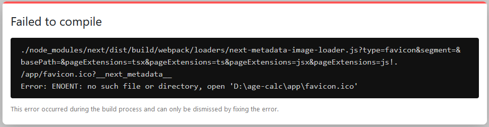
Replace the favicon.ico with your choice of the favicon or the frontend mentor favicon in the app directory. Please note the frontend mentor favicon is a png file and you can use any free online converter to convert it to an ico file.

The app directory must have a favicon.ico file, otherwise, it will throw a compilation error.
Put the icon-arrow.svg, received from the project starter file, in the public folder.
Step 3: Install Dependencies ⚙️
I'll be using a Light/Dark mode toggler for this project, and for that, we need react-icons and next-them packages. In the VS Code terminal run npm i react-icons next-themes

The updated package.json should look like this

Step 4: Configure tailwind.config.js 🧮
To toggle dark mode manually in tailwind.config.js we need to use the class strategy instead of the media strategy. So set darkMode: 'class', and the colors defined in the style-guide of the project.

Step 5: Components folder & files 📂
Create a components folder in the project root with ModeProvider.tsx, ModeToggle.tsx and AgeForm.tsx files

ModeProvider.tsx File

ModeProvider.tsx Explanation
"use client"; directive is used on the very top of the file to make it a client component so that we can add client-side interactivity to our application.
Next, we are importing the ThemeProvider component from the next-themes library and the useState and useEffect hooks from the react library. ThemeProvider is used to provide a theme to the application and useState and useEffect are used to manage component state and perform side effects respectively.
Then, the interface specifies that the component should receive a children prop that is a ReactNode, which can be any valid JSX element. interface in TypeScript is like a blueprint or a contract that describes the structure and behavior of an object.
After that, we are exporting ModeProvider component (react functional component) which takes the children prop as an argument and uses destructuring to extract it from the props object. The ModeProviderProps interface is used to specify the type of the props object.
The mounted state variable is initialized to false using the useState hook.
The useEffect hook runs on component mount, sets the mounted state variable to true, and has an empty dependency array to ensure it only runs on mount. This way we can avoid Hydration Mismatch.
If the component is not mounted, it returns the children prop wrapped in empty JSX tags.
Otherwise, it returns the ThemeProvider component wrapped around the children prop. The ThemeProvider component provides a theme to the application and uses the attribute prop to specify that the theme should be applied to the class attribute of the HTML element.
ModeToggle.tsx File

ModeToggle.tsx Explanation
We already know why "use client"; directive is used.
We start by importing the necessary libraries and icons for the ModeToggle component. useState and useEffect are hooks provided by React, FaSun and FaMoon are icons from the react-icons/fa library, useTheme is a hook provided by the next-themes library, and GiPlayerTime is an icon from the react-icons/gi library.
Then, we export the ModeToggle component in which the mounted state variable is initialized to false using the useState hook. The useTheme hook is used to get the current theme and the setTheme function is to switch between light and dark mode.
The useEffect hook manages component side effects which runs on component mount, sets the mounted state variable to true, and has an empty dependency array to ensure it only runs on mount.
Next, we check If the component is not mounted with an if block, and if the condition is true it returns null to render nothing.
Finally, if the component is mounted successfully, the mounted state variable is set to true, and the content of the component is rendered normally. Which includes a GiPlayerTime icon, an h1 and a button element. The GiPlayerTime icon and the h1 do not play any important role, I just add them for fun 🤣 When the user clicks on the button an anonymous arrow function is called using the onClick event which checks whether the theme (current theme) is 'light'. If the condition is true the theme is set to 'dark' using setTheme and if the condition is false the opposite is done using a ternary operator.
In short, the button element toggles between light and dark modes when clicked.
The icon displayed in the button depends on the current theme - if the theme is light, a FaMoon component is displayed, and if the theme is dark, a FaSun component is displayed.
Step 6: Configure the layout.tsx 🧮
A freshly minted layout.tsx file should look like this

The modified layout.tsx file
Modified layout.tsx file Explanation
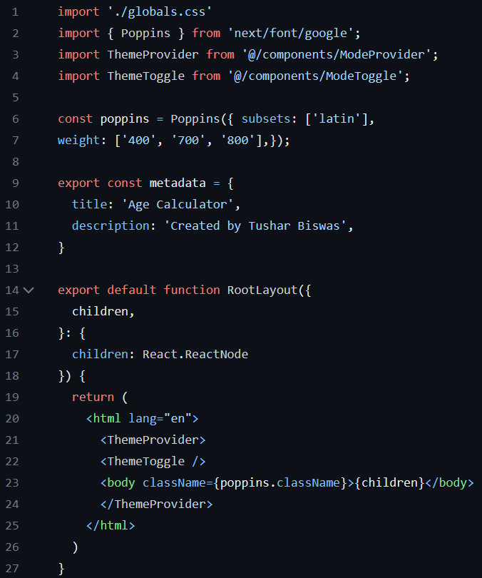
For this project, we need to use the Poppins font, hence replacing Inter with Poppins🍬
Then, the ModeProvider component is imported from the ModeProvider.tsx and stored in a variable called ThemeProvider. And the ModeToggle component is imported from the ModeToggle.tsx and stored in a variable called ThemeToggle.
Next, we define a Poppins constant that is used to load the Poppins font. The Poppins function is called with an object that specifies the font subset to load (latin) and the font weights to include (400, 700, and 800).
After that, we modify the metadata constant that is used to specify metadata for the page, such as the title and description. The metadata is exported so that it can be used in other parts of the application, such as the page component.
Further we define the RootLayout component as a default export. The component takes a children prop that is a ReactNode, which can be any valid JSX element.
The component returns a JSX tree that includes an html element with a lang attribute set to "en". Inside the html element, the ThemeProvider and ThemeToggle components are rendered, followed by a body element that has a className attribute set to poppins.className. The className attribute is used to apply the Poppins font to the body of the page. The children prop is rendered inside the body element.
Overall, the RootLayout component provides a common layout for all pages in the application.
Now, go to your VS Code terminal and run 'npm run dev' command

If everything goes fine you should be able to see the first version of our project on url: http://localhost:3000 and you should be able to manually toggle the theme.


Many congratulations on reading this far! 🎉 Please take a break ☕️🌼and come back refreshed 💪💫to continue the journey.
Step 6: Build the AgeForm.tsx 💻
Our main logic of the project is written in this file and it's ~180 lines long. In a typical age calculator, the user enters a birthday and gets the age on the current date. In case of any invalid entry, the application throws an appropriate error. That is exactly what we are going to do.
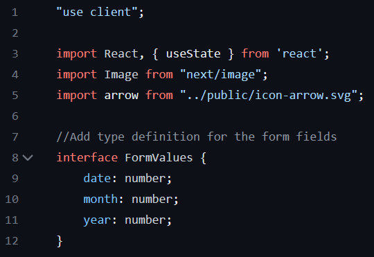
So, as you can see in AgeForm we start with "use client"; directive and then import React library and the useState hook from the react package (no need to import React in Next.js I forgot to remove it 🤦), the Image component from the next/image package, and the icon-arrow.svg from the public directory.
Again the useState hook is used to manage the state within a component. The Image component is a built-in component in Next.js that is used to optimize and serve images. The public directory is a special directory in Next.js that is used to serve static files, such as images, that do not need to be processed separately.
Then we define a custom TypeScript interface FormValues obj and add the type definition. We already know about interface from ModeProvider.tsx.

After that, we create and export AgeForm, which is a react functional component. In which, first we initialize the state variable formValues using the useState hook. Then, initialize another state variable age using the useState hook. Next, initialize one more state variable errors with the initial value of an empty array.
📝 Please note, in TypeScript, there are multiple ways to define the type of a state variable. The type of the formValues is specified using TypeScript interface, age is specified using inline object literal syntax and errors state variable is specified using generic type definition.
Then, we define a handleChange function that takes an event object of type React.ChangeEvent. It Destructures the name and value properties from the target property of the event object. Next, it calls the setFormValues function with a new object as an argument. The new object is created by spreading the previous values (prevValues) and replacing the property with the name of the name with the parsed value as a number.

Next, we define handleSubmit function that takes an event object of type React.FormEvent and Prevent the default form submission behavior with `e.preventDefault();`
After that, it calls validateForm function with the formValues object as an argument and destructures the isValid and errors properties from the returned object.
And checks whether the form is valid using the if block. If the condition is true, it creates two new Date objects: today is the current date, and birthdate is a new date object created using the year, month, and date properties from the formValues object. Note that the month is subtracted by 1 because Date expects the month to be zero-indexed.
Then, diffInMs calculates the difference between the today and birthdate in milliseconds by calling the getTime method on both objects and subtracting them.
diffInYears calculates the difference in years by dividing diffInMs by the number of milliseconds in a year and taking the floor(rounds a number DOWN to the nearest integer) of the result.
diffInMonths calculates the difference in months by getting the remainder of diffInMs divided by the number of milliseconds in a year, and then dividing that by the number of milliseconds in a month. The result is then floored.
diffInDays calculates the difference in days by getting the remainder of diffInMs divided by the number of milliseconds in a month and then dividing that by the number of milliseconds in a day. The result is then floored.
Next, handleSubmit logs the age in years, months, and days to the console and sets the age state variable to an object with the years, months, and days properties.
Lastly, if the form is not valid, it sets the errors state variable to the errors object returned by validateForm.

Now we define validateForm function that takes an object of type FormValues as an argument. Then declare a variable errors and assign it an empty array. And the type annotation indicates that errors is an array of strings.
Then it checks if any of the required fields (date, month, or year) are empty. If so, adds an error message to the errors array and returns an object with isValid set to false and errors set to the errors array.
Thereafter, it converts the day, month and year values to number and checks whether the day is between 1 and 31, the month is between 1 and 12, and the year is in the future (i.e. greater than the current year) in next three parts of the function. If the conditions are true an appropriate error message is pushed to the errors array.
Next, isValidDate function is defined which takes three arguments (d, m, and y) which are numbers specifies by the type annotation and returns true if the date is valid. The function checks if the month is between 1 and 12, the day is between 1 and the last day of the given month (using new Date(y, m, 0).getDate() to get the last day), and returns false otherwise. If the date is invalid, it pushes an error message to the errors array.
Finally, it checks if the errors array is empty (returns a boolean), meaning all checks are passed. If so, it sets isValid to true. Otherwise, sets isValid to false and returns an object with isValid and errors.

When the form is submitted by the user handleSubmit is called. Whenever the input field's value of DAY, MOTH, or YEAR changes handleChange event handler function is called and does its job.
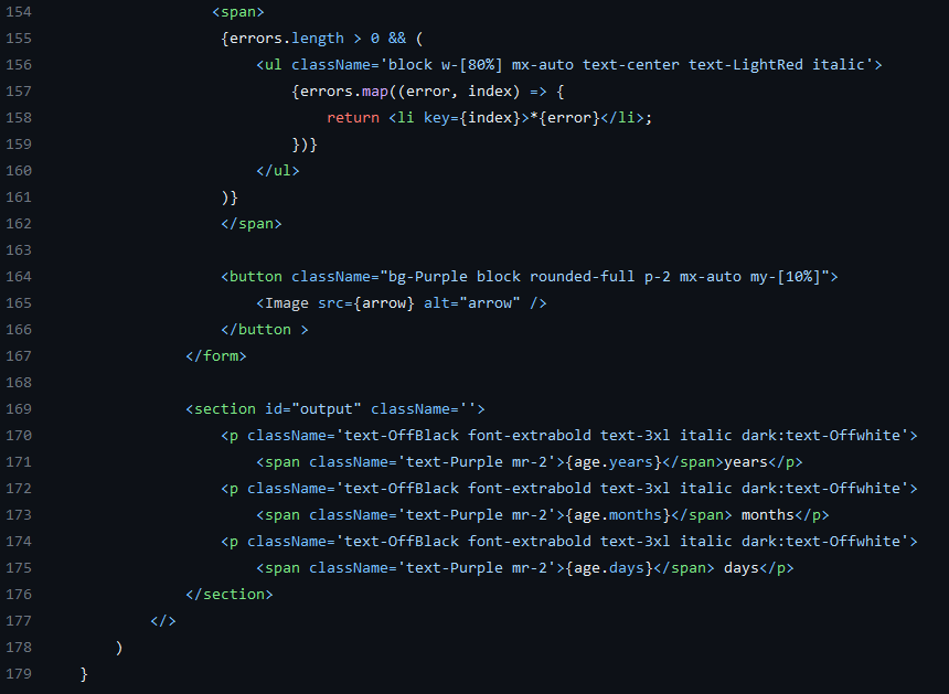
Next, it checks if the errors array has any elements. If the array has elements, it maps over the errors array and returns a new li (list item) element for each error message. The key attribute is set to the index of the error message to ensure that each list item has a unique key. The button element is self-explanatory and in the output section, the result is dynamically displayed as years, months and days.
Step 7: Configure the page.tsx 🧮
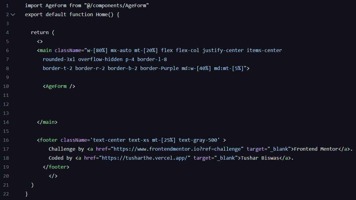
Let's go to page.tsx in our app directory and import the AgeForm from the components folder and simply return it inside the main element. And finally, add the footer.
Hello there! 👋 Thank you very much for taking the time to read this post. 🙏 Your engagement means a lot to me! 💖 If you found this post valuable or think it could benefit someone else, please feel free to share it. 📲✨ so that it can reach and inspire more people. Together, let's spread knowledge and positivity! 🌍🌟


![History of SaaS [1960s-2020s] Emergence, Evolution, and Impact](/_next/image?url=https%3A%2F%2Fcdn.hashnode.com%2Fres%2Fhashnode%2Fimage%2Fstock%2Funsplash%2FDuHKoV44prg%2Fupload%2F42c6382f71ecc519f04b83fe9f9c67e9.jpeg&w=3840&q=75)